
Apple adopting San Francisco for system font
From Wikipedia, the free encyclopediaSan FranciscoSan Francisco is a typeface made by Apple Inc. and used as the system typeface on its Apple Watch. It is a somewhat condensed sans-serif typeface with adaptive spacing and line heights.Designers have described it as similar to a more condensed [...]

Design Awards are a waste of time and money
I wholeheartedly believe this. Read the great blog post below for a similar opinion on the matter and a much better writer that I am. Paying (for) Attention

30 Creative Beer Labels and Bottles
Great post from Spoon Graphics with 30 creative beer labels and bottles. I like Shilling by Moodley. http://blog.spoongraphics.co.uk/articles/30-creative-beer-bottle-label-packaging-designs?utm_content=buffer6a003&utm_medium=social&utm_source=twitter.com&utm_campaign=buffer
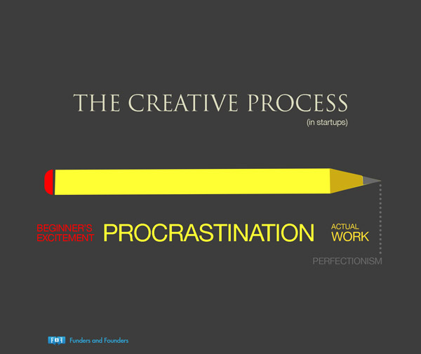
27 Funny Posters/Charts Designers Will Relate To
Cool collection of posters poking fun at some of the things graphic designers encounter. http://digitalsynopsis.com/design/27-funny-graphic-designer-posters-charts/#.VL57u2qNqhM.facebook
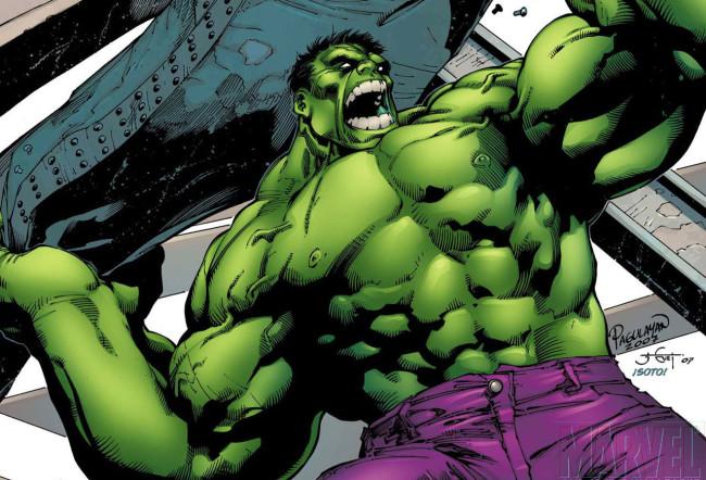
Why Hulk Wears Purple Pants
Here's an excellent blog on color harmony. It's explained well and has awesome examples of variations of color harmony. Excellent resource for making good color decisions in your designs. http://www.zevendesign.com/color-harmony-hulk-wears-purple-pants/

Ingenious New Typeface
Here's a cool new font, Obsidian, that may represent the future of font design - rendering them from algorithms. Article about Obsidian on the Wired website